Retina text that keeps its spacing, embeds at their real size, and an address bar that keeps up
On a retina screen, text in system fonts ran words together and left uneven gaps, because the threads that draw the page never received the font's size-specific details. They do now, so the app draws text exactly as the engine measures it. Full-width embedded frames draw at their real size instead of a stretched 300px picture, the address bar shows where a redirect landed, fonts named in a style attribute get the right system face, gridline tables lose a stray bottom line, and Return right after typing an address always goes there.
Retina text that keeps its word spacing


In the app on a retina screen, bold headings ran their words together and body text had uneven gaps. Two things were wrong. At 2x the engine picked the font's large-size cut, whose letters are narrower than the cut layout measured with; it now chooses the cut and the letter tracking at the size the text was laid out at. And the threads that draw the page in the app had never been given the font's optical sizes, tracking and kerning, so they drew with a plain face; they now get the same font tables as the engine. A test draws text on a separate thread and requires it to match the engine thread pixel for pixel.
Embedded frames at their real size
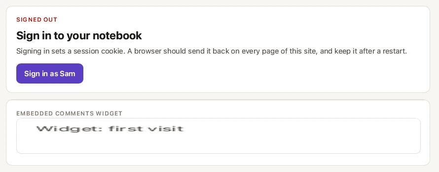
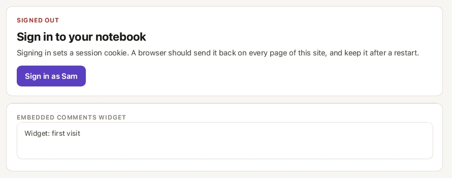
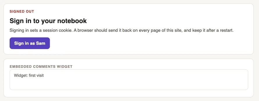
An embedded comments widget sized width: 100% was laid out at the 300px default and its picture stretched across the real box, so its text came out wide and blurred. Frames whose size is not a plain pixel length (percentages, calc, flex and grid items) are now laid out at the box they actually get, and match the reference browser.