Pages laid out the way their authors wrote them, and less memory again
A page-drawing release with more memory saved. Comparing Floati's picture of a page with the reference browser's, pixel by pixel, on a set of well-known sites showed where Floati laid pages out wrongly, and fourteen of those mistakes are fixed: which style rule wins when two disagree, how a line break, a grid, a flexible row and a font size written as a sum behave, where a line of text sits, and more. A design framework's documentation page went from 26 percent of its pixels different to 5, a news front page from 35 to 20. On memory, the same 33 randomly picked popular sites now use 4,301 MB in Floati against 10,377 MB in the reference browser on the same Mac (59 percent less; 0.1.378 used 4,524), the average site settles at 130 MB, and Floati uses less than the reference browser on 29 of the 33. Pictures nobody can see, because they are fully transparent or hidden, now give back their memory, and pictures on sharp screens are kept at exactly the pixels they are drawn at. Measured and tested on a Mac; the Windows build passes the same engine tests.
Pages look the way they were written
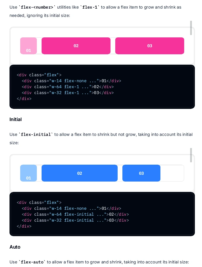
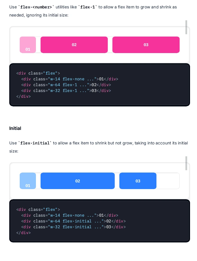
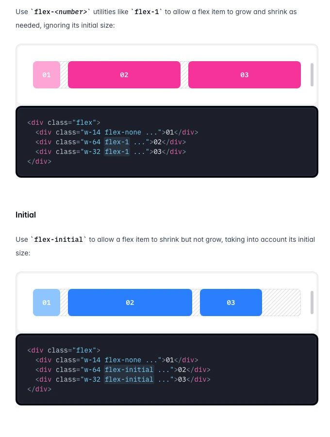
To find layout mistakes we draw well-known pages in Floati and in the reference browser and compare them pixel by pixel, then shrink each difference down to a few lines of page code and check that rule against the reference. Fourteen fixes came out of it. When a site's style sheet marks a rule as important it now beats a style written on the element itself, as the standard says; it used to lose, so menus and buttons sat in the wrong place. Rules written with the newer selector forms (is, where, not, has) now weigh exactly as much as they should, so the right one wins. A line break at the end of a line no longer starts an empty extra line. A font size written as a sum (a calc) is worked out once, so everything inside inherits the size and not the formula. A line height written in em or percent is fixed where it is written, so text inside a bigger heading does not grow its own gaps. Grids now share the height of a tall item among the rows it spans the way the reference does and understand rows named by the page, flexible rows stretch their items to the exact height the page set, an overlay over a picture covers the whole picture, labels meant only for screen readers no longer push the header down, and a button with a two-line label lines up with its neighbours. Every fix has a test that fails without it.
Less memory on the same random sites
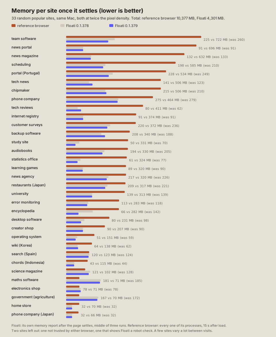
The same 33 sites as in the last two releases, picked at random from a public list of the most visited websites, opened in Floati on the same Mac at twice the pixel density, three times each (the middle result is shown). Floati used 4,301 MB in total, against 10,377 MB for the reference browser and 4,524 MB for 0.1.378, and less than the reference browser on 29 of the 33. Three changes did most of it. A picture that is fully transparent or hidden (the resting slides of a fading slideshow, for example) is not drawn, so it now gives its memory back like a picture far down the page, and takes it again the moment it shows. On a sharp screen a picture is kept at exactly the pixels it is drawn at, where Floati used to keep a quarter more in case the box grew, and background pictures are kept at the size they are painted, not their full file size. And each picture keeps only one form: the compressed file or the drawn pixels, whichever it needs, never both. An encyclopedia went from 142 to 66 MB, a study site from 70 to 50, a team software site from 260 to 225. Four sites still use more than the reference browser: a maths software site, a government site, a science magazine and a shop, mostly because of large pictures and the compiled code of scripts that never run.